:::
products
The content will change immediately to the new sorting and filtering criteria after the select are changed.
today
Piman A11Y UI Framework
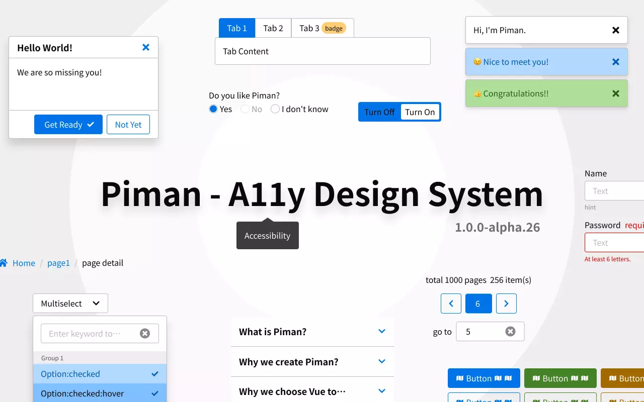
Piman is an open-source UI framework based on Vue, with a focus on accessible web design
Choose: Data Visualization
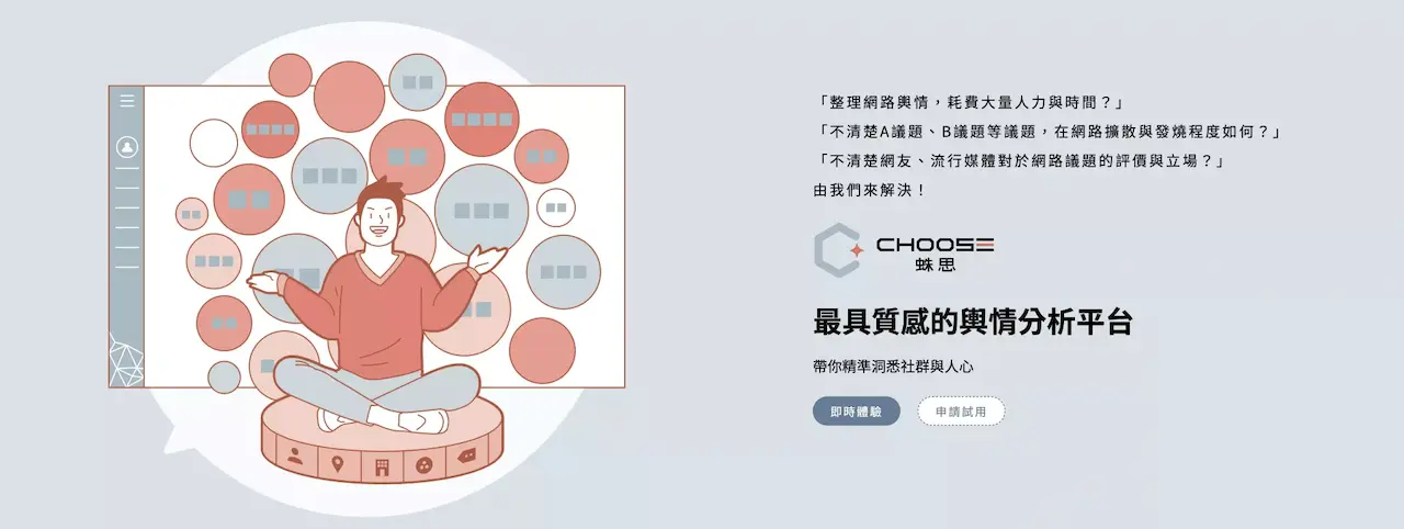
Choose: Data Visualization
2021
BPGCMS
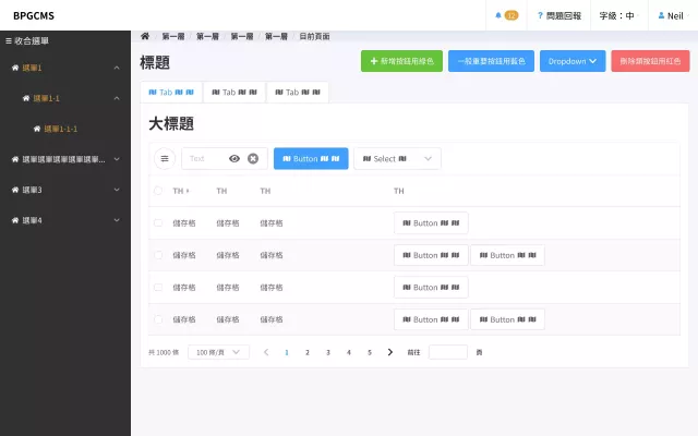
Content Management System
[Side Project] Poinfo
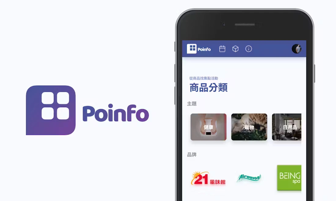
A platform for collecting stamp reward programs in Taiwan.
2019
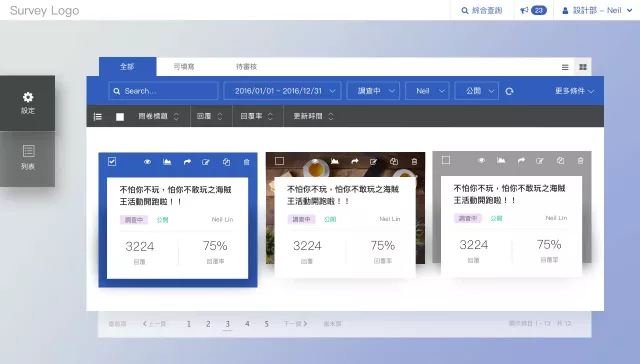
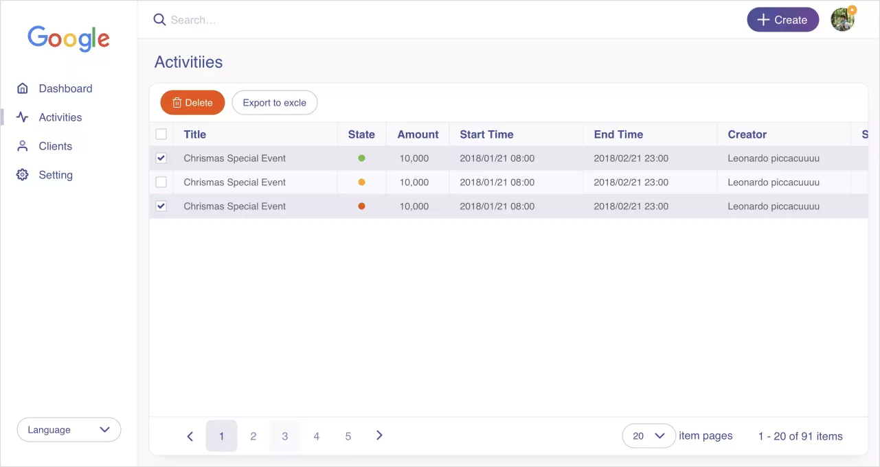
Vital CRM(Wireframe)
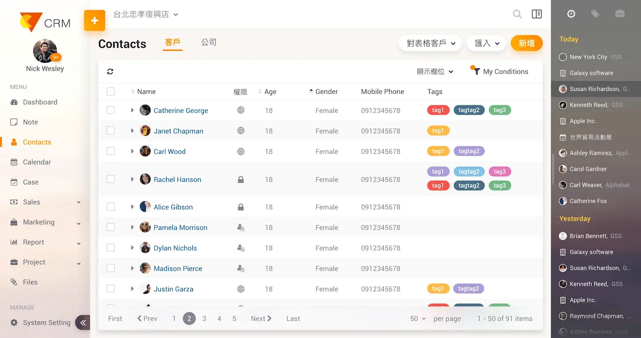
New Version
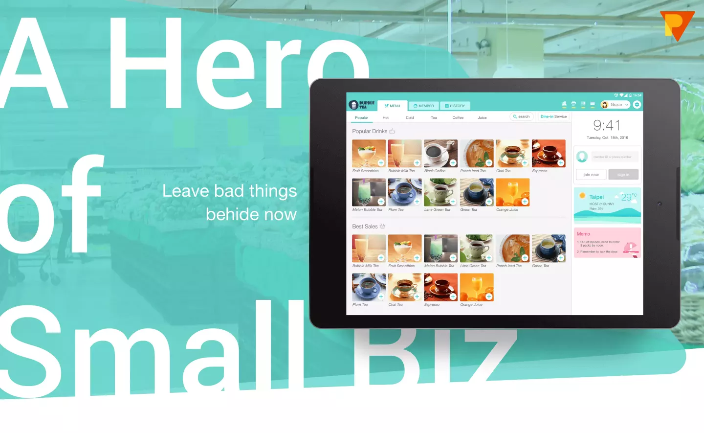
Vital TTC
By utilizing different feedback, rewards, and membership tier mechanisms, we stimulate consumption and retain loyal customers.
[Side Project] Workether
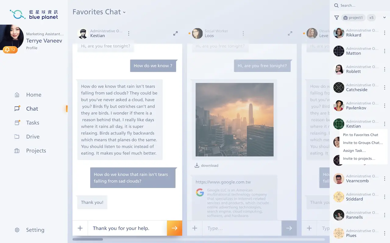
A real-time communication software for internal corporate use, integrating project management, file sharing, and information sharing into one service.
[Side Project] 2Pick1
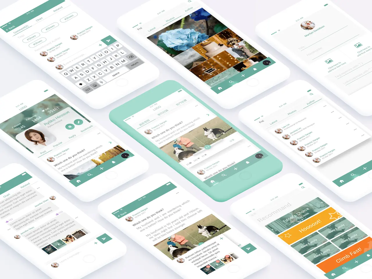
A platform that allows users to make choices through a 2-pick-1 format.
2018