2026/06/22 update:now remove Google Lighthouse.
--
1. A familiar, frustrating scene
You open Google, type in your query, and ten blue links appear.
You click the first one — it’s full of ads, so you close it.
The second — tons of images, but no useful content.
The third — you press the Tab key a few times, and the cursor disappears somewhere…
Eventually, you wonder:
Am I just being too picky?
2. The problem isn’t “too much information” — it’s that we can’t see usability
Most modern search engines rank results based on SEO, page speed, and content density. But what actually makes a site usable is deeply practical — and often subjective:
- Can you navigate with just a keyboard?
- Do the headings make sense?
- Are ads covering the main content?
- Is the color contrast strong enough to read comfortably?
These aren’t things we can evaluate from a link preview. We only find out after clicking — by spending time, patience, and emotional energy.
3. What I wanted to change: Make experience visible before you click
That’s when I started wondering:
What if you could see a website’s accessibility state right at the moment of search?
Not to assign ratings. Not to label or shame anyone. But to simply ask:
“Has this website made an effort to be comfortable and usable?”
I’m not trying to build a new search engine. I just want to make user experience visible, at a glance.
That’s where the idea for Accesserty Signal began.
What is Signal?
It’s not a rating — it’s a helper for decision-making
Accesserty Signal is a lightweight Chrome extension that adds a simple badge to each Google search result:
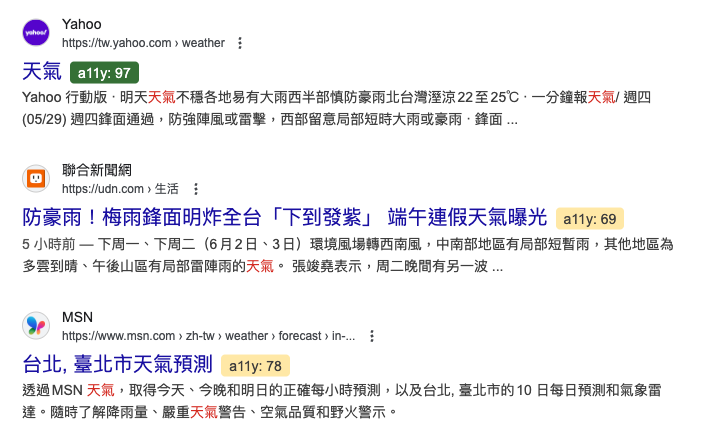
This number comes from Lighthouse, a widely used accessibility audit tool. It’s explainable, standardized, and easy to compare.
It’s not a judgment. It’s not a curated “good websites only” list. It’s just a small clue to help users choose where to click.
Why I refused to make it a rating system
Because I didn’t want this to become another “score game.”
Too many platforms reduce experience to 1–5 stars, and it always ends up with:
- Manipulated ratings (via marketing bots)
- Misleading reviews (1-star due to a bad mood, not the product)
- Used to pressure creators (“fix this or we’ll expose you”)
I wanted to avoid all of that.
The accessibility score in Accesserty Signal is just a neutral indicator. Real improvement still depends on whether the website wants to improve.
It’s just the beginning — but it adds a little transparency
I know Accesserty Signal won’t change the web overnight. But it does one small thing:
It makes experience visible — not something users have to discover the hard way.
If you’ve ever hesitated before clicking a link, unsure if the site would be a pain…
If you’ve ever closed a site because it felt too messy or hostile…
Then you’ve already felt the invisibility of user experience.
Accesserty is my way of trying to make that gap more visible, understandable, and improvable — one badge at a time.