UI/UX Frontend Designer with 13 years of experience in web and app design and development. In recent years, I have been dedicated to accessible web design.
Language🌐The content will change immediately to the new sorting and filtering criteria after the select are changed.
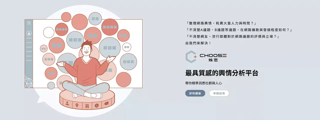
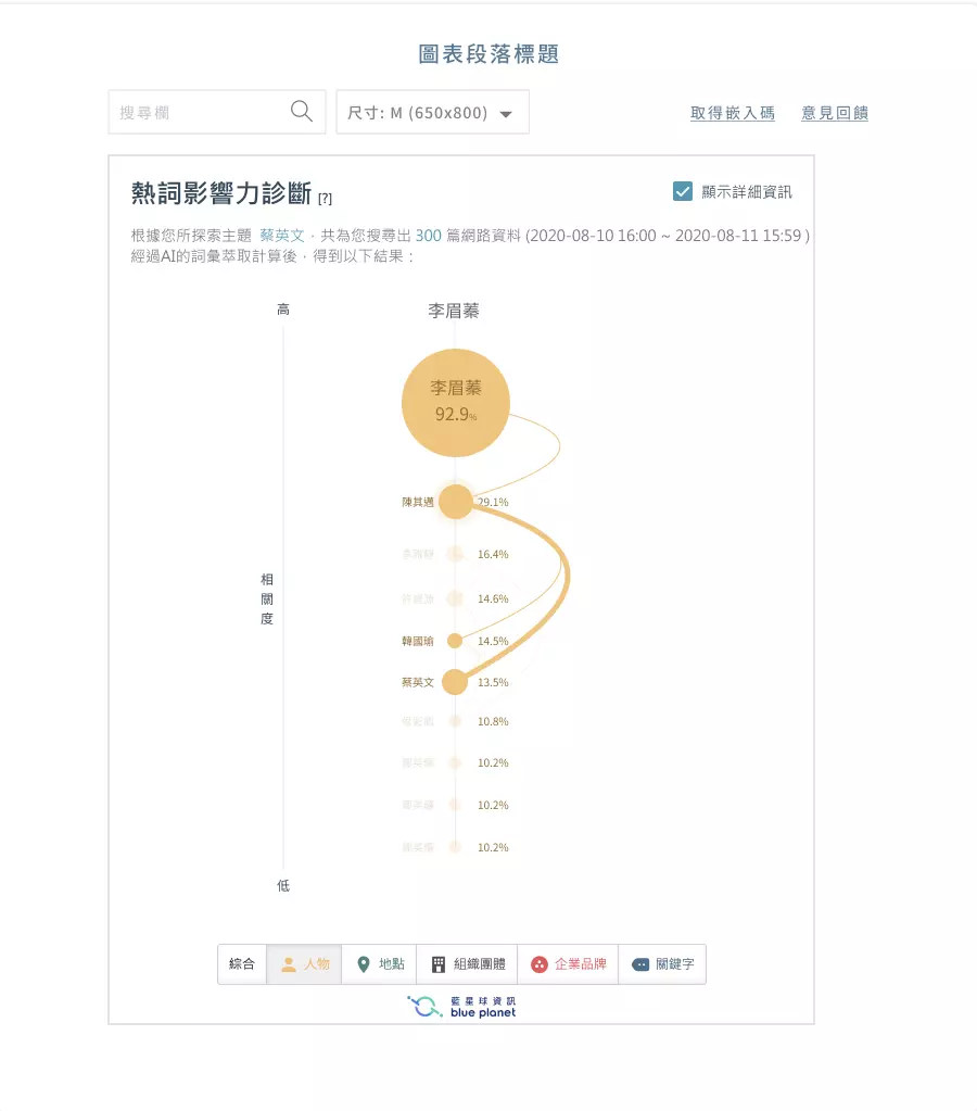
Choose is an all-encompassing tool that aggregates vast amounts of news and social media data to become your most helpful assistant. It assists you in observing key trends related to specific topics, generating concepts for events and campaigns, and handling PR crises in real-time. It is designed for PR professionals, marketers, brand consultants, media agencies, and advertising agencies, providing comprehensive support for their needs.This article solely introduces the data visualization of Choose.
target
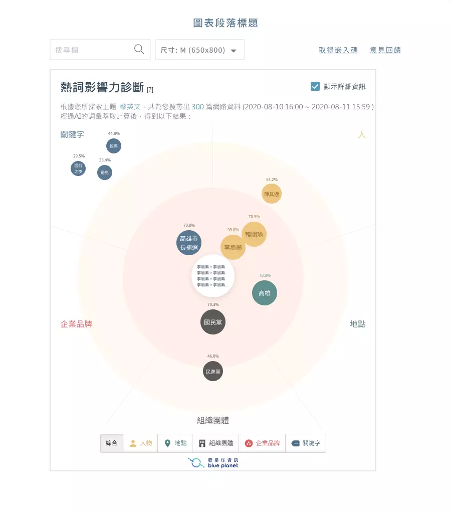
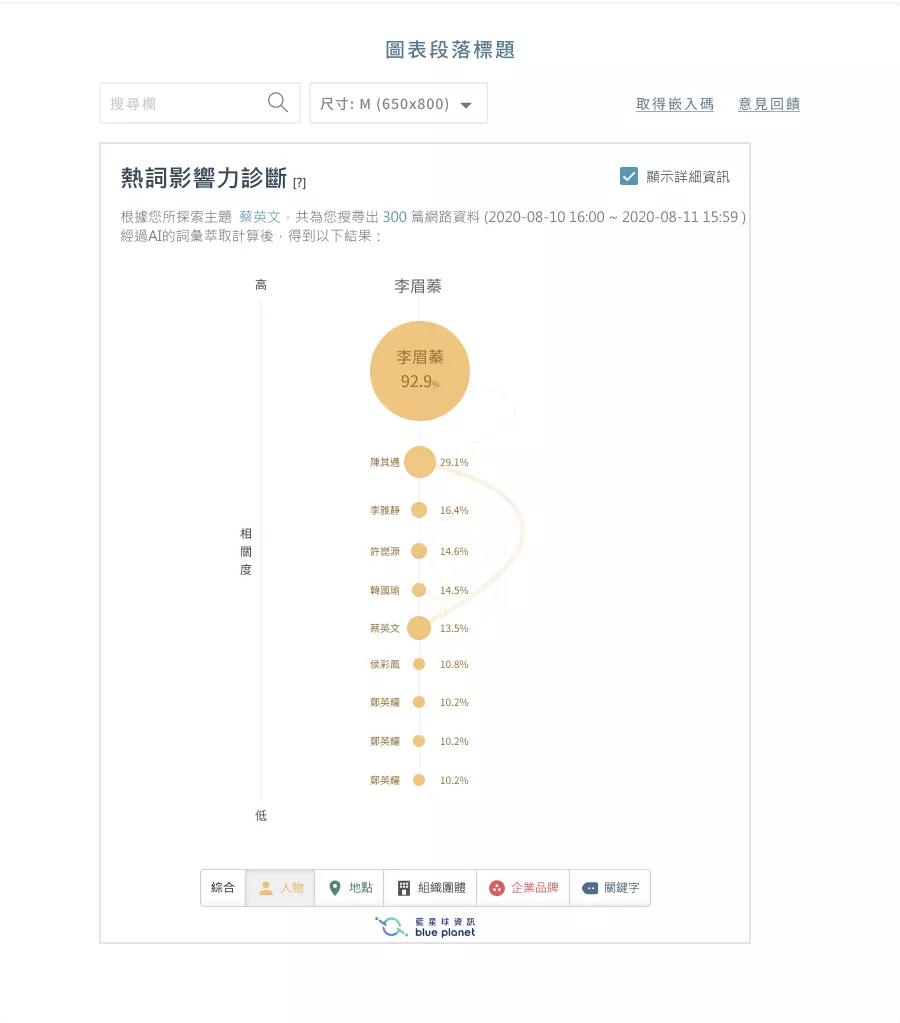
Quickly grasp the relevance of target content and five dimensions.
Quickly grasp the relevance between the five dimensions and target content.
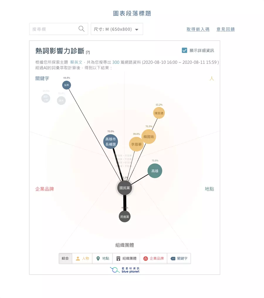
Quickly grasp the relevance among different project contents.